Custom Settings
Custom CSS
Verano theme gives advanced users and developers the ability to add their own CSS code directly from the control panel:
- Easily override default styles without editing core theme files.
- Great for adding personal touches, adjusting spacing, changing colors, or styling specific components.
- Helps maintain theme updates compatibility, since your custom styles are kept separate.
- We use the CodeMirror library to enhance the coding experience and make working with code more enjoyable.
Whether you're a developer or just someone who wants more control — Custom CSS gives you the power to fine-tune the look and feel of your forum.
Tutorial
Copy and paste this code into your custom css editor and save the settings.
html { --vo-text-color: #990faf;}html.dark { --vo-text-color: #e772f9;}Result
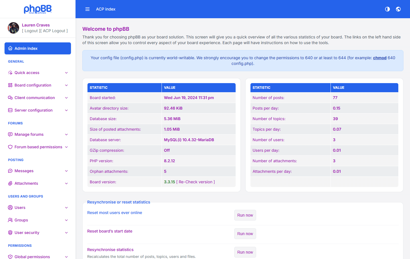
In this example, the text color will be changed in both light and dark modes.

Theme Color Variables Explanation
Below is a detailed explanation of all color variables used in the Verano Theme and how each one affects the visual appearance of the Admin Control Panel.
| Variable | Description |
|---|---|
| Base & Background Colors | |
| --vo-bg-color | The main background color used across most areas of the Admin Control Panel. Provides the primary dark tone of the theme. |
| --vo-bg-color-light | A lighter variant of the main background color. Often used for descriptions, secondary panels, or areas that require softer contrast. |
| Theme & Accent Colors | |
| --vo-theme-color | The primary accent color of the theme, used for interactive elements such as buttons, active states, highlights, and important UI components. |
| --vo-theme-color-hover | A darker version of the theme color used when hovering over buttons to provide a clear interactive feedback effect. |
| Secondary & Supportive Colors | |
| --vo-secondary-color | A light gray tone used for secondary UI elements such as labels, helper text, and subtle borders. |
| --vo-secondary-color-light | A lighter variant of the secondary color, often used for muted text, descriptions, and less important details. |
| --vo-link-color | The default color for clickable links inside the Admin Panel. Ensures visibility and contrast on dark backgrounds. |
| --vo-menu-active-item-color | A transparent highlight color used to indicate the currently active menu item in the navigation. |
| Text & Panels | |
| --vo-text-color | The main text color used throughout the theme. Designed to be highly readable on backgrounds. |
| --vo-panel-color | The background color of panels, cards, boxes, and containers. |
| Borders | |
| --vo-border-color | Standard border color used for forms, containers, tables, and input elements. |
| --vo-border-color-light | A lighter or equal variant used for subtle borders where a softer separation is needed. |
| Table Colors | |
| --vo-table-row1 | Background color for odd table rows. |
| --vo-table-row2 | Background color for even table rows. Helps create alternating row contrast. |
| --vo-table-row3 | Used for table header rows or highlighted rows — darker to distinguish them from regular rows. |
| --vo-table-p-row3 | Secondary variant similar to row3, often used in sub-tables or nested table elements. |
| --vo-table-row4 | Additional variant used for wider tables or special row types. |